Internal Web Portal for Onboarding and Managing Temporary Staff

Timeline
5 months (Feb - Jul 2024)
Role
UX Designer
Team
3 UX Designers, 3 Developers, 1 Product Manager, 1 Business Analyst
Overview
As part of my internship, I worked on a project to design a web portal aimed at streamlining the onboarding process for new temporary staff. The primary goal was to simplify the experience for both HR and Managers, centralizing various onboarding tasks into a single platform. The challenge was to create a user-friendly interface that catered to both experienced managers and those who were new or infrequent users.
Due to the internal nature of the project, I have limited visuals to share. However, the designs I contributed played a significant role in shaping the project's direction.
My role
In this project, I served as the UX Designer. My responsibility was to design user flows and interfaces based on the user requirements provided by the project manager. I collaborated with a team, each member focusing on specific aspects of the portal. My role involved creating design solutions that meet the needs of our diverse user base while working within the constraints of time and resources.
Challenges
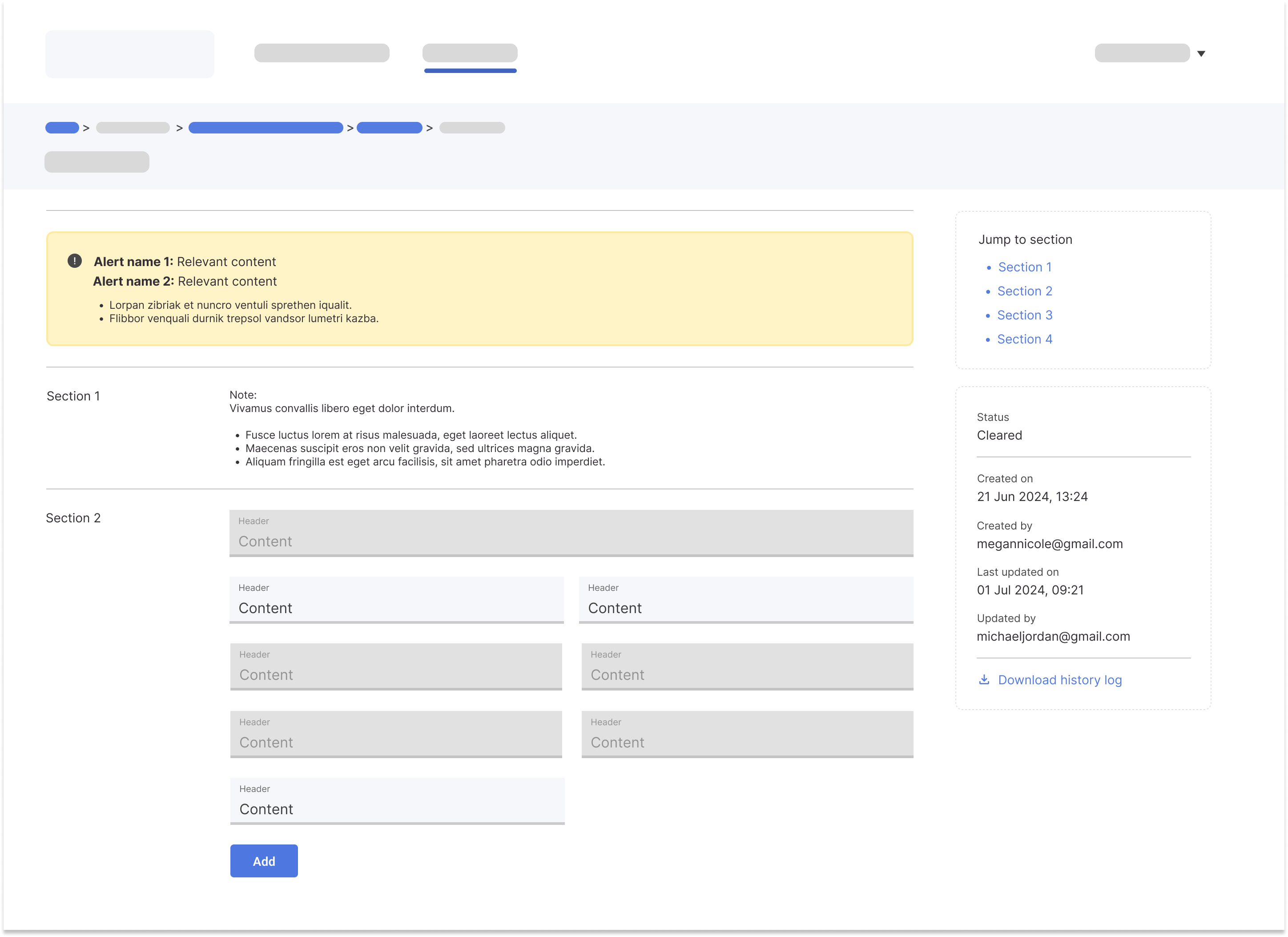
One of the main challenges we faced was designing with both experienced and novice managers in mind. We needed to ensure the portal was intuitive and easy to navigate, even for those unfamiliar with it. Additionally, it was crucial to inform users about a new feature that allowed them to request work-related tools directly through the portal—a task that previously required emailing multiple departments.
To address these challenges, I proposed two design solutions:
- Wizard Flow: A guided process that would walk managers through the onboarding tasks step by step, ensuring they were aware of the new features.
- Notification Section: A prominent notification bar or section at the top of the forms that would inform managers of the tasks required and highlight the new tool request feature.


Due to resource and timeline limitations, the team opted for the notification design. However, we later conducted user testing to evaluate its effectiveness.
Process
The project was in its early stages when I joined. I began by referencing the design structure of the existing portal and aligning it with the new user requirements and stories documented in Jira. Using Figma, I developed low-fidelity mockups to visualize different design approaches.
As the project progressed, we created high-fidelity prototypes in Figma, which were used to conduct usability testing. These prototypes provided a more detailed and realistic view of the final product, allowing us to gather more accurate user feedback.
Usability Testing: We tested the notification design with actual users, who appreciated the visibility of the notifications but often skimmed over the content, leading to confusion about next steps. This feedback was critical in reassessing our design approach.
Outcome: Based on the user testing results, the team decided to revisit the wizard flow concept for a more guided experience. Unfortunately, my internship ended before I could see this idea fully implemented.
Outcomes and Impact
While the project is still ongoing, my work aimed to provide a more streamlined and efficient onboarding experience for managers. By reducing the number of touchpoints and centralizing tasks in one portal, the project has the potential to save significant time and reduce communication delays between managers and departments.
Although I left before the project was completed, my design ideas continue to influence its development. The team appreciated my contributions, and my work on the project helped lay the groundwork for its continued evolution.
Lessons Learned
- Documentation is Key: The importance of preserving design history became evident when the team decided to revisit a previously discarded idea. Proper documentation ensured that we understood the reasons for past decisions and could address previous concerns when revisiting the wizard flow.
- Communication Across Roles: I learned how to effectively communicate with various stakeholders, from developers to project managers, and the importance of considering their perspectives in the design process.
- Usability Testing Logistics: Conducting in-person usability testing required meticulous preparation, especially when coordinating with high-level participants. Ensuring that test locations were convenient and well-suited for the interviewees was crucial.
- Team Collaboration: I realized that good ideas can come from anyone, and it's important to listen to and integrate feedback from all team members. This experience reinforced the importance of collective decision-making and taking ownership of design outcomes as a team.
Thank you for reading!
Back to Top